Challenge
Improve contextual understanding around (non-live) prototype feedback.
Constraints
InVision tries to be methodology agnostic, with a low learning curve.
Product
InVision is a tool for quickly prototyping designs and getting feedback on those design.
Result
InVision's head of research said it was fantastic and shared it with his CEO and team.
Background
I love InVision for prototyping and getting live feedback. However, I was disappointed with the results from asking for non-live feedback on my prototypes (i.e not in-person or over a call). I wanted InVision to tell me more. I wanted to know where people were pressing what they were tapping and how they went through the product. It told me the total time they spent but I wanted to know how that broke up per page. So, I identified the problem I was having as: "Not having enough context around how people were using the prototype."
Persona

Interviews
After creating a persona, I wrote an interview discussion guide. I went out and talked to InVision users who create prototypes and ask for (non-live) feedback.
Consolidated my notes down to the most salient points seen above.
Then I consolidated further.
What I found is most designers were getting feedback in clumps of 3-4 users (InVision team later corroborated this). One freelance designer said he just wanted a temperature check with his clients between milestones. He wanted to ensure he was on the right track. He'd share prototypes with them and either get no response or one word replies. "I want better feedback.. or any feedback". Sure eventually he'd meet with them and get the feedback but by then he'd already be off track. "Not sure they went through the whole app (prototype)". He figured if they went through the app and didn't say anything then all is good, but if they didn't fully go through it then he could be in trouble. Other individuals vocalized similar issues. They also wanted to know what users were pressing. One person even said he wanted "a layer that can see what people are tapping.. like a heat map". However, the largest take away for me was just how important understanding the user's flow was. "Most importantly (I want to know) the order they tapped in", "I want to understand their flow."
As I designed I got my prototypes in front of as many people like Josh as I could. This resulted in a number of iterations that ultimately ended up with a design better suited to their needs.
Ideation - Tap Tracking
I tried to make it feel like something that could fit with the existing design language and user experience (since this project they have rolled out a drastic change). The product tries to be methodology agnostic, so when thinking of a solution I had to think, can this fit many different work styles. Here are a few of the main solutions I thought through.
Solution One - Heat Maps
I started off with the idea of heat maps. These are often used on the web to generate insights so why not use them in prototyping? After further analysis I realized that this wouldn't necessarily work for many situations. On a computer, where the mouse hovers, typically is where the eyes go. However, there is no hover state on the mobile devices. Only tracking clicks/taps would feel like an empty canvas. Therefore this solution would only work for web prototypes which is a smaller subset of the InVision users.
Solution Two - Screen Recordings

I thought about doing screen, capturing this seemed the simplest route. However, after deeper thought I realized if we captured the entire session's video, we'd likely have to ask for the user's permission. This would make some people quit the test and it'd probably bias the results. 50% of designers felt it would be necessary to get permission from test subjects (e.g. clients) to do screen recordings. However, all of the people I interviewed felt it wasn't necessary to notify users about any other type of tracking such as clicks, heat-maps or time on page.
Solution Three - Tap Tracking Side Panel

Here I thought what if you could go through a handful of test subject's flows at a time via a side panel. You could simply click between each individual and the larger group. When a user was selected you'd see the data surrounding their flow and click to go through it. This interface would likely help manage a large number amount of feedback. However, I did worry this made the product feel heavier, would prescribe a methodology (I.E. against InVision's goals). I also felt this wouldn't work very well for website design as it'd cover a large portion of the screen.
Solution Four - Tap Tracking Dynamic Pop-up

Here the concept was a dynamic pop-up that would allow you to follow a test subject's flow through the product. Similar to the design above I want to inform the designer of user's flow. I felt a dynamic pop-up located near the action in question would do a better job of bringing the designer into their test subject's mindset. I felt this more dynamic approach would better suite a larger range designs and processes (i.e. satisfying InVision's Methodology agnostic philosophy).
In most cases this shouldn't get overloaded with data as most designers only collect feedback in clumps of 3-4 test subjects. Even if this went up I felt notifications could be utilized to tell designers that they have gotten feedback thereby encouraging them to clear it.
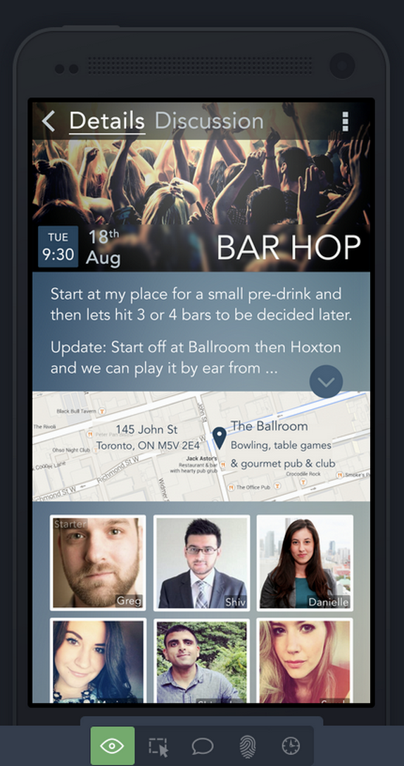
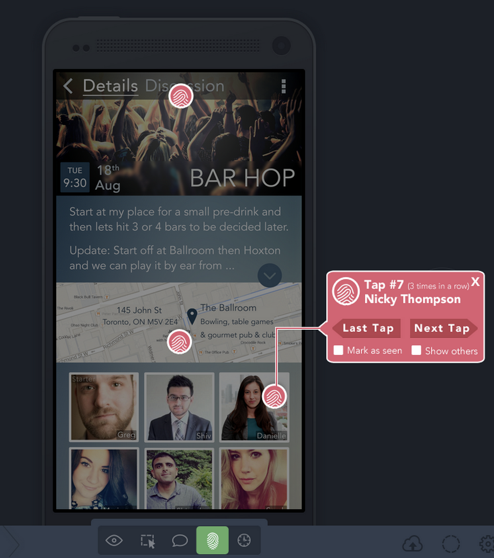
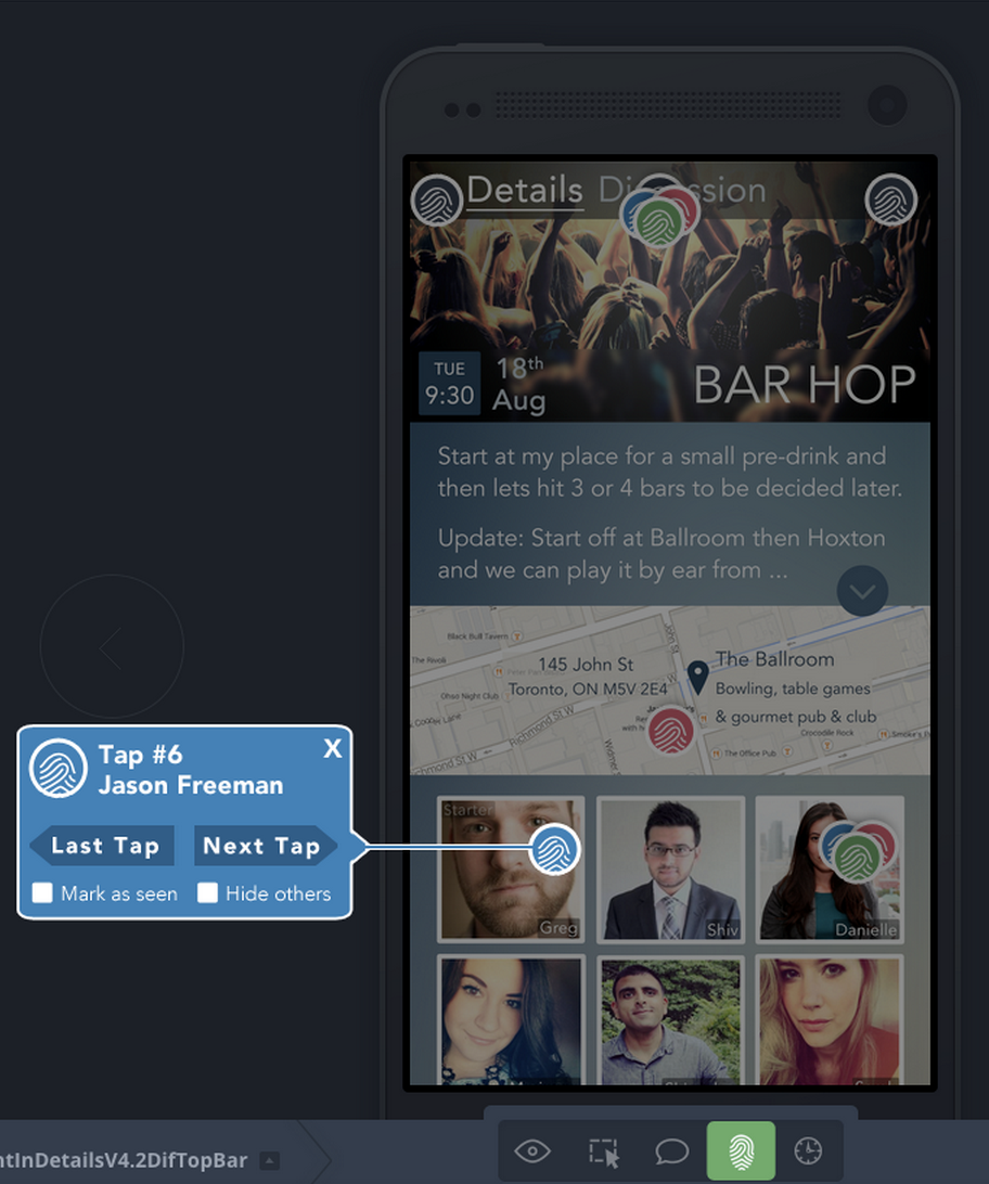
Prototype - Tap Tracking Dynamic Pop-up

I used InVision to create this InVision feature prototype (I know it's very meta).
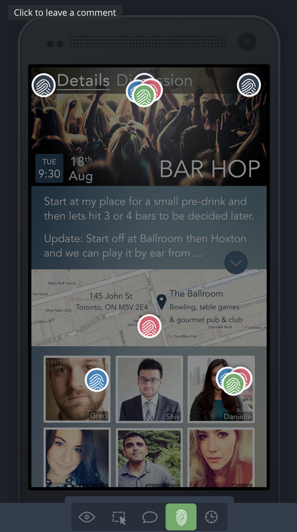
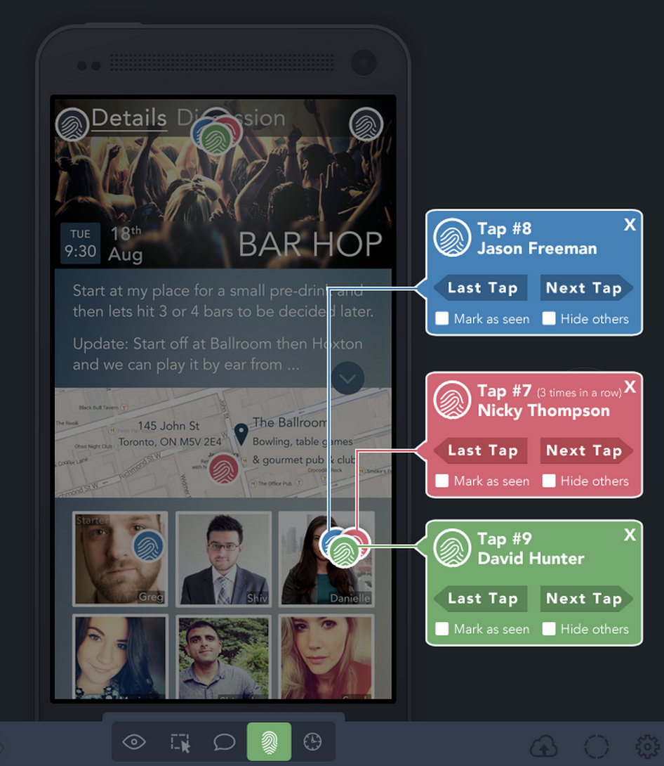
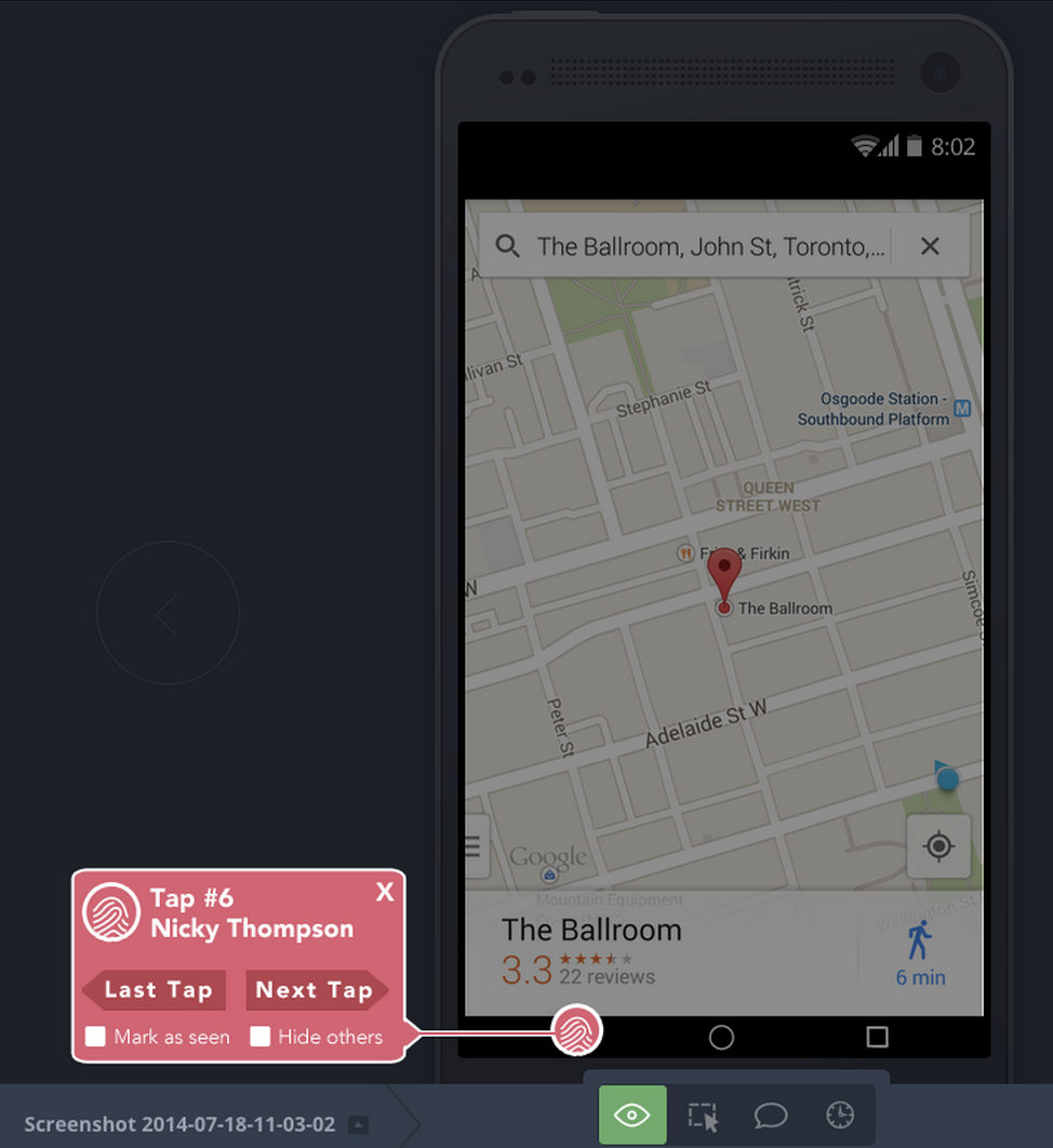
Here you can see a designer opening up the tap tracking feature (the green fingerprint icon at bottom), and following the flow of their test subject (Nicky in red) through each tap. They hit show others to view all subject's taps and then mark one (Jason in blue) as seen.
Rather than adding another bottom tab I wanted to build this feature to co-exist within the commenting section. However, for the sake of this project I felt it'd be faster to separate it out and it would help ensure the feature could stand on it's own.

I decided to go with a fingerprint over a curser because I felt it would remind the designer that a real human is on the other end of this design. "First we build the tools, then they build us” - Marshall McLuhan. Since empathy rarely extends beyond our line of sight I feel our tools need to increase this line of sight to the user. Any effort in deepening this connection between designer and user should have exponential impact on the end product. Hopefully, overtime we can even increase designers' empathic abilities.
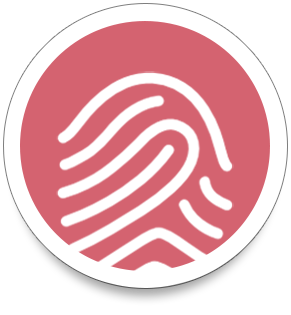
People have pre-existing notions, expectations and context around cursers. Often these pre-existing notions can be a good thing that a designer intends to employ. However, in this case I wanted to break away from the pre-existing notions that come with cursor icons. I felt the fingerprint icon immediately informs you that someone has tapped here. I went with a cleaner simplified version of the finger print because it was easier to distinguish at lower resolutions.