
Product
Hootsuite is a social media management application, that can combine multiple social networks into
one integrated dashboard.
Result
Uncovered a number of issues new Hootsuite users faced and created solutions to address them.
Challenge
Find the issues new users have in learning to use Hootsuite.
Role
User Researcher
I started using Hootsuite shortly after it launched in 2008 and still use it regularly. However, I have not been unaware of it’s usability issues. I was very curious to see how easy it was for new users to learn.
Usability Testing
I conducted guerrilla usability tests on Hootsuite with a number of different participants in various coffee shops around San Francisco. I targeted people who use at least two social networks and post at least 14 times a week. I offered to buy them a coffee in exchange for answering questions for 15 minutes.
I informed my participants that: I was not testing them, I was testing the product. I did not design the product. I don’t and never have worked at Hootsuite, so they shouldn’t be afraid of offending me. I appreciated it if they thought out loud. In addition, nothing will be posted to their social network(s) and that if they'd like, I will show them how to delete their Hootsuite account after the exercise.
With consent, I took notes, captured screen and audio recordings (due to the nature of the product I felt there was too much personal information in the videos to upload them here). The study covered:
- The landing page
- Signing up
- Setting up Hootsuite feeds
- Scheduling a post
- Editing/deleting a post
Analysis
Upon completing my usability tests, I went through my notes and recordings and put observations on post-it notes to visually display my findings. I began by displaying my observations by user (each color represents a different user).
Then I broke down the observations by common pain points (seen above).
Evaluation

I mapped out my findings according to impact on new users and ease of implementation. As you can see adjusting Hootsuite's complicated layout would have the largest impact on new users. However, when implementation time is taken into account, it is clear that work should be started with clarifying the wording and iconography as this will have the largest impact per time spent. Although changes to the landing page and other communications are easier to implement, one must consider that they will have a smaller impact on new users. This is because many users will skim through these pages, decide not to scroll down (only 2/5 participants went below the fold) or go straight to signing up without reading (as 1/5 users did).
Findings & Recommendations
Confusing icons and wording
- I would suggest making the following wording and Icon changes as some of the wording used by Hootsuite contradicts what users are familiar with. When a new user's curser hovers over a important word or icon for long enough, have a little explainer show up explaining it. At the bottom of this little explainer should be a check box to turn off this functionality. Changes should include 'publish' to 'Post' and 'stream' to '(News) Feed'. 'Compose message' should be changed to 'submit/schedule post' as users thought compose message sounded like they were sending a message to another user as opposed to posting to a platform such as twitter. 'Add link' should be changed to 'shorten link'.
Attach, schedule, add location, privacy or targeting icons/options do not need to be shown at all times. Only when actually composing the post.
Landing page and other communication

Original

The adjusted section is in the green box (to highlight the change). Additionally, I felt there was too much in the top menu and that it throws off the symmetry. However, users did not bring this up.
- I believe a landing page should follow the 4 E’s Messaging Framework (messaging can speak to more than one but can't do all equally). The four Es are: Explain, Emotion, Evoke (questions) or Exclude/Include. Since Hootsuite has stated that they don't just want brand managers, we can eliminate 'exclude'. Also, since they play in a space that typically has low emotional connotations we can eliminate that strategy. That leaves explanatory & evoke. We could go with explanatory, "Control your online presence, with Hootsuite’s free social media manager." Or evoke, "Are you getting the attention you deserve?". This strategy gets the reader to ask the question and drive their curiosity to look further into what Hootsuite can do to address this. These two suggestions are just the tip of the iceberg. Either may work, but I'd suggest running a larger brainstorming session and then A/B testing a handful to see what provides the best results.
- The landing page also has an issue where users don't go below the fold (2/5 went below the fold). This is an easy fix by pulling up the content so that you can see the edge of the next section. I could see that they don't want people to see this section to drive people to go through social log ins. However, this still means they are missing out with new users.
Tutorial/On-boarding
- Instead of having users log in with an empty data set and no idea what the “add stream” section does. I’d recommend taking their social data and setting up a standard (previously tested) format. This way users understand how most people use the platform vs. confusion.
- When you walk them through the tutorial, zoom in on the message you want them to read and fade out the rest of the page. This was asked for by a user and I agree it can decrease the distraction and disorganization that most users complained about. I'd also recommend having a single spot for the explainer tutorial box and just zooming in on it so the user doesn't get frustrated.
- Each tutorial box should have a button to allow the user to skip the entire tutorial process.
- The tutorial was inconsistent on when it would come up or if it would come up at all. This may be due to a bug or some technical limitation. Either way they Hootsuite should try to address this to ensure it always comes up for new users.
Improving the complicated layout
- For new users, learning Hootsuite can often be overwhelming because it has a lot of capability. The site should deemphasize any additional functionality that is not necessary for a new user. For example, within analytics they could hide all the different network based data sets within each network (seen below). Any feature that's not getting large use should be cut out or at least cut out from the free version. All of the unused features just add a lot of weight and confusion for new users of the product and it's not needed.
The site was originally designed for Twitter and the users can tell. It’s heavily oriented towards short text as opposed to audio, picture and video. Since it’s launch, there have been a number of other social networks that have grown in popularity. These include Instagram, Pinterest, Tumblr, Snapchat, Vine, let alone any Asian networks like WeChat. If they want to truly deliver on their brand promise of 'combining multiple social networks into one integrated dashboard' they need to be designed to properly display the other forms of content.
- Add stream and App directory should be consolidated into one.
If I am not currently a part of an organization I shouldn’t have an entire tab that asks me to join one.
Is there really a need for the publisher tab? The majority of the app's functionally is around publishing (posting) yet most of this does not happen within the publisher tab. In fact, I don't think it really needs the entire side bar.
In sections where it says there are no messages scheduled, the compose post box could be integrated at the top of it.


These two popups should be integrated. If a user goes to the integrated version (of these two different popups) and they haven't set up a network to work with their hootsuite (e.g. Twitter) they should see the option on the left if they do have it set up with Hootsuite then they should see the right. Hootsuite also needs to work on getting more networks integrated here (such as Instagram, YouTube, WeChat etc).

Often Hootsuite's solution for integration is just adding another tab. This is not ideal as it can feel overwhelming.

Here Hootsuite gave my home city time as opposed to my actual location (San Francisco). It should set the time zone to where the user is unless they specify differently in settings.

Settings shows options that are also shown as soon as you click the settings button. Therefore this is redundant. (see above gif)
Within settings I suspect the 4 additional tabs under "Account" would be overlooked by users. No other side menu (within a pop-up) has these additional tabs. Further usability testing could be used to prove or disprove this hypothesis. I wonder if having the additional tabs
as no other section also has to find as this is the
have 4 additional tabs when these additional sections could have just as easily been put on the popup's side bar or within this single account page. Further usability testing could be used to prove if people Why does

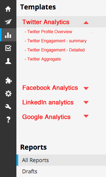
Here you can see the difference between the current analytics tab (on left) and my recommended shortened analytics tab on the right (red color is to highlight distinctive difference from current setup).
Summary
To increase or simply to maintain a company's growth rate typically it is vital that new users can easily learn how to use the product and derive value from it. If it takes too long or too much thought to learn how to use it you will likely lose them. If they don't get value out of the product upfront they may not come back. This is why it is really important to conduct usability tests with new users.
Conducting these tests allowed me to uncovered four main pain points Hootsuite should look into: Confusing icons/wording, issues with the landing page/messaging, issues with on-boarding/pop-ups and general issues with learning the UI. Once I had categorized these issues I prioritized them based on impact on new users and ease of implementation. Finally I constructed a number of different potential solutions to address these challenges making it easier to on-board new users thereby decreasing drop-off and ultimately positively impacting Hootsuite's growth.